Although it seems like little more than a toy by today’s standards, the original Apple Macintosh was revolutionary when it debuted in 1984. Its graphical user interface meant that for the first time, personal computer users didn’t have to understand computer code, and the software that came bundled with it, MacPaint and MacWrite, was aimed squarely at working creatives rather than programmers or gamers.
Collectively, the comic book industry didn’t appear to see much use in such a tool. No surprise considering that in comics, even the lettering was still done by hand, but in fairness the end result of work produced on the Macintosh was relatively unsophisticated and couldn’t come close to looking like hand drawn work, nor would it save comics artists much in the way of time or effort. But while the Macintosh wouldn’t be able to emulate the look of contemporary comic book art, the graphics it created had a distinctive style of their own, a style that seems perfectly fitting for Shatter, a title which its publisher First Comics billed as “the first computerized comic!”
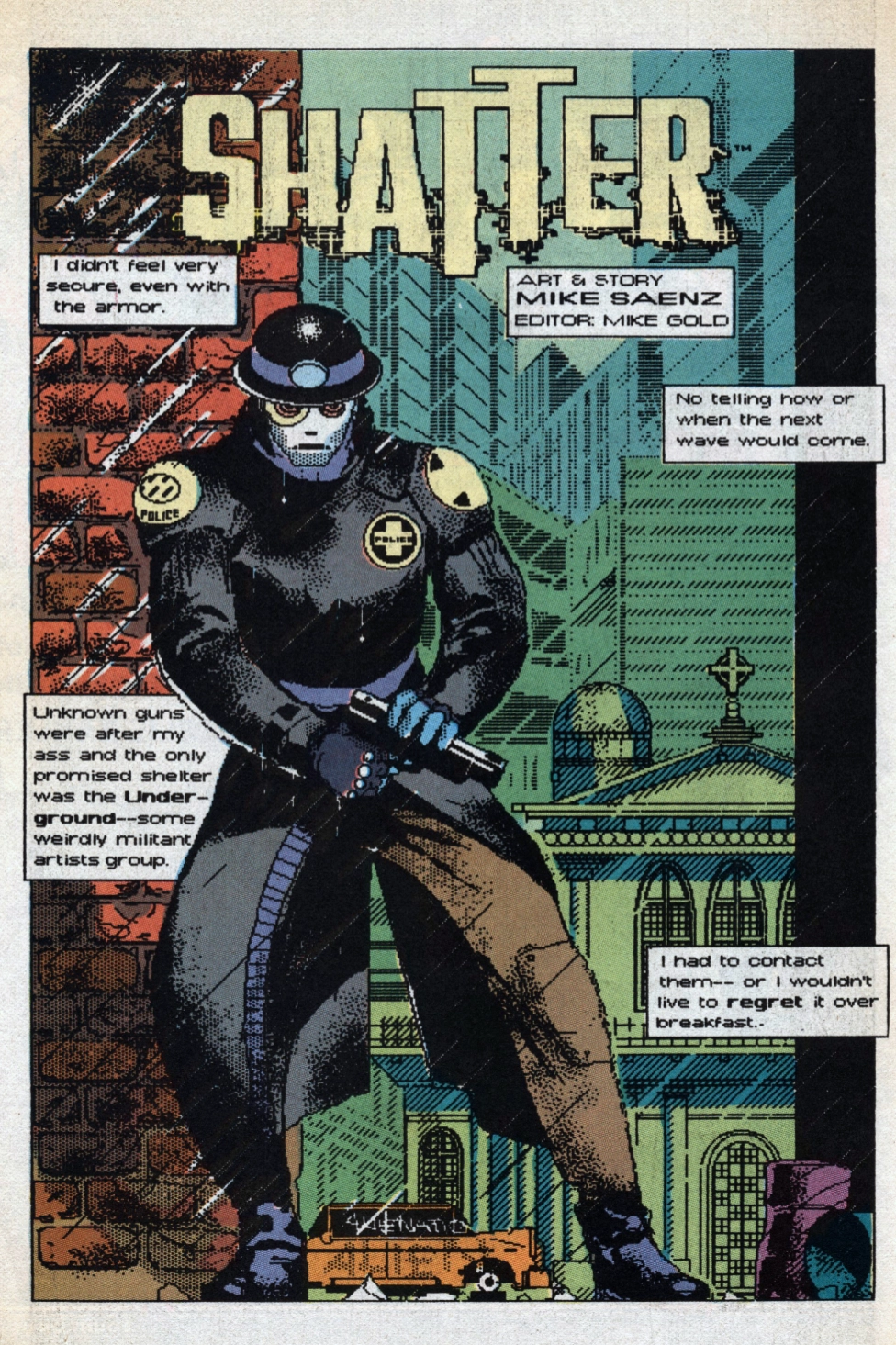
After a brief preview in a British computer magazine, First Comics published Shatter Special #1 in June 1985, intended as a lead-in to an ongoing series that would appear as eight page backup stories in Jon Sable Freelance, one of their more popular titles. Every aspect of the series would be done entirely on the Macintosh…except for the color, which, according to editor Mike Gold, “would take far, far too much time.” Series co-creators Peter B. Gillis and Mike Saenz came up with a dystopian near-future storyline that is fairly uninspired Cyberpunk 101, but tailor-made for the Macintosh’s “computerized” look that they wanted to take advantage of.
Mike Saenz was an accomplished traditional illustrator and no stranger to future dystopia, having illustrated several stories for Marvel’s Epic Illustrated that cover the cyberpunk gamut from lethal video games to identity-destroying virtual reality to fast food corporations engaging in open warfare. His work on Shatter reads like an artist excited to explore the possibilities of a new tool, but it’s really his hand-coloring that elevates the work produced on the Macintosh and makes it coherent and readable.
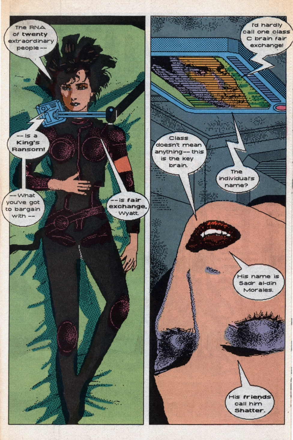
Shatter Special #1 introduces us to Jack Scratch, AKA Shatter, real name Sadr al-din Morales – “dumb name, really…my parents tried to cosy up to their Arab employer,” our hero explains – a police subcontractor who responds to emergency calls on a freelance basis. Again it’s textbook cyberpunk that owes a huge debt to Blade Runner, Philip K. Dick, and William Gibson, right down to the flying cars, neon-soaked cityscapes, and cynical, world-weary narration.
Ready to cash it all in after a domestic call turns into a paramilitary ambush, Shatter changes his mind after seeing an ad for a rare canister of original Coca-Cola syrup (“something that hasn’t been made since 2034”). He reluctantly decides to take on the proverbial “one last contract” to pursue and detain a wanted murderer. His investigation takes him through a cavalcade of the usual tropes. It’s always interesting to look at what the past thought the future would be like, but the cyberpunk subgenre has been justifiably criticized for falling back on the same tired elements over and over again, and Shatter is no exception. In its defense, the genre was fairly underrepresented in the comics of the time, and the story and setting do seem tailor made to best utilize the computer drawing tools. But maybe that’s part of the problem – the whole thing feels a little like a gimmick rather than a sincere attempt to tell an interesting story.
Shatter eventually meets Cyan, a femme fatale who drags him into a plot to harvest and sell human RNA, which provides artistic talent to the otherwise talentless, at least on a temporary basis. The only problem is, the RNA donor’s brain is destroyed in the process. According to an interview in Amazing Heroes #71 (May 15, 1985), the idea that Shatter (and most of the other working stiffs who occupy their near-future dystopia) is essentially a temp worker is central to the story, which at its core is about corporate interests exerting control over its workforce by bottling and selling skills and talent. If nothing else, it does seem to accurately predict our current world’s emerging “gig economy,” especially the lack of respect or appreciation that corporate leadership seems to have for the abilities of its workers. Co-writer Peter B. Gillis elaborates:
“If a perceptive observer sees this as an allegory for the way we think creative people are treated in society today – he’s right. This is one of the things we think is very dangerous about America: that it’s overmanaged, that money and glory are given to managers and not to the people who actually create, or actually have skills to create new ideas, new products, and new wealth.”
The story ends on a cliffhanger that leads into a backup feature published over several issues of Jon Sable Freelance. Over the course of these chapters we see Saenz getting more familiar with the Macintosh and its possibilities, with a lot of repeated images, zoom-ins, and text incorporated into the backgrounds. Unfortunately the color work takes a step backwards owing to the lower quality paper – the results are flat and perfunctory, and do little to elevate the artwork.
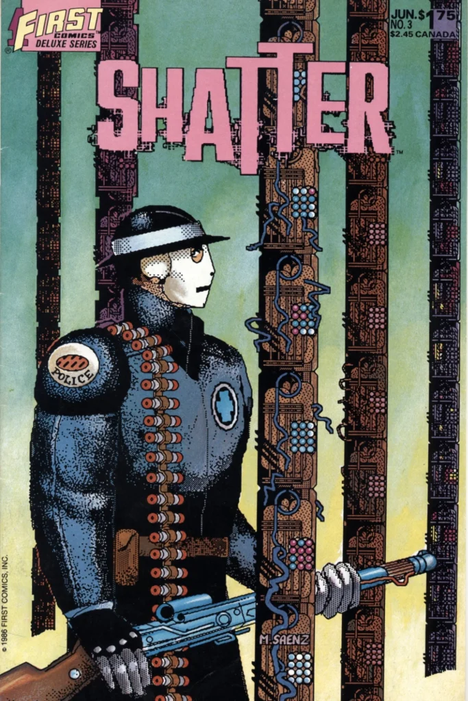
After six short chapters and an unprecedented second printing of the original Shatter Special, the title was given its own ongoing series with a new #1 issue, cover dated December 1985. By this time Saenz had taken over writing the series, and with the new Shatter #1 he also resumes hand-coloring the computer-outputted artwork, getting it closer it to the quality seen in the original special. While still prone to falling back on standard cyberpunk tropes, Saenz proved to be a sly writer with a great ear for sarcastic dialogue.
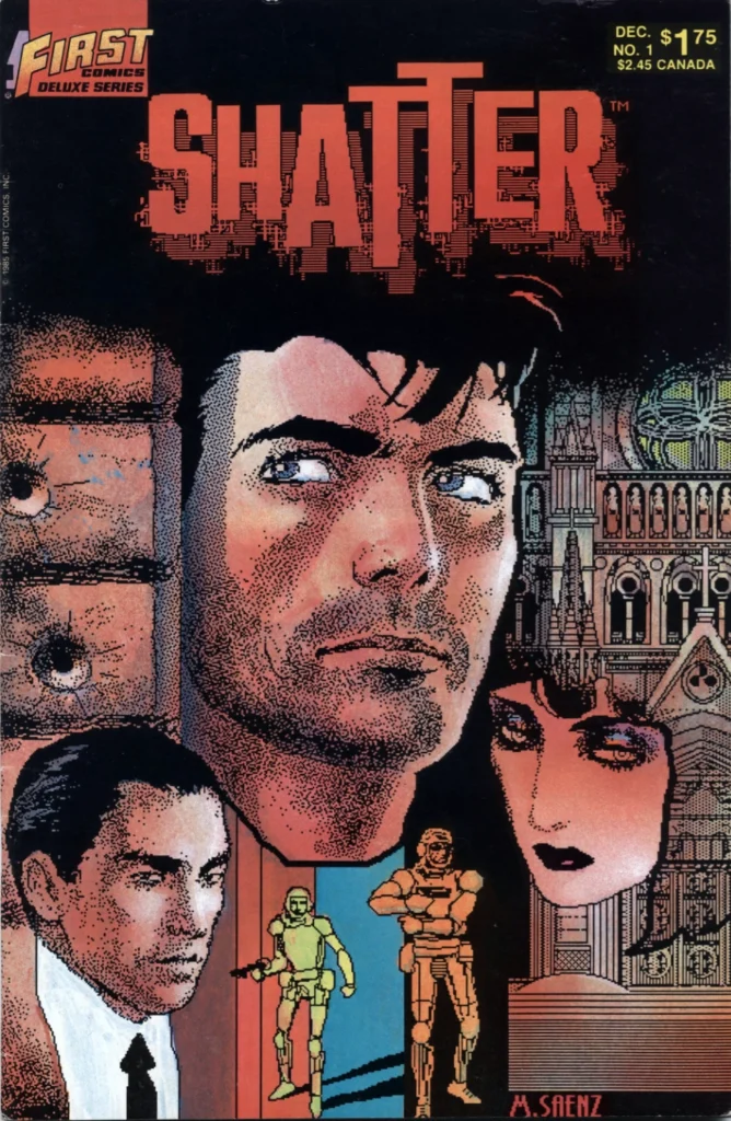
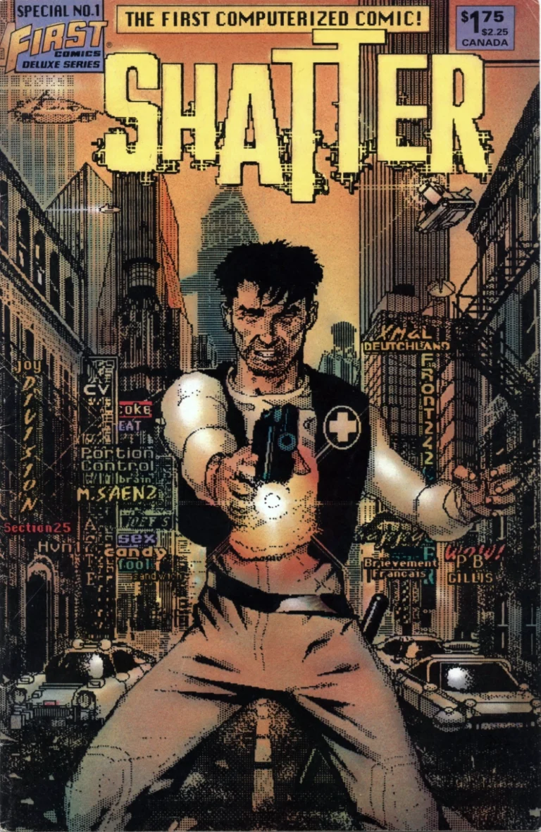
Cover to Shatter #1, artwork by Mike Saenz. © 1985 First Comics Inc. 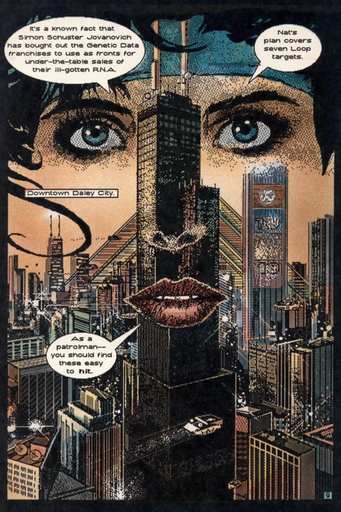
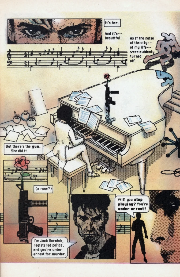
Page from Shatter #1, words and artwork by Mike Saenz. © 1985 First Comics Inc. 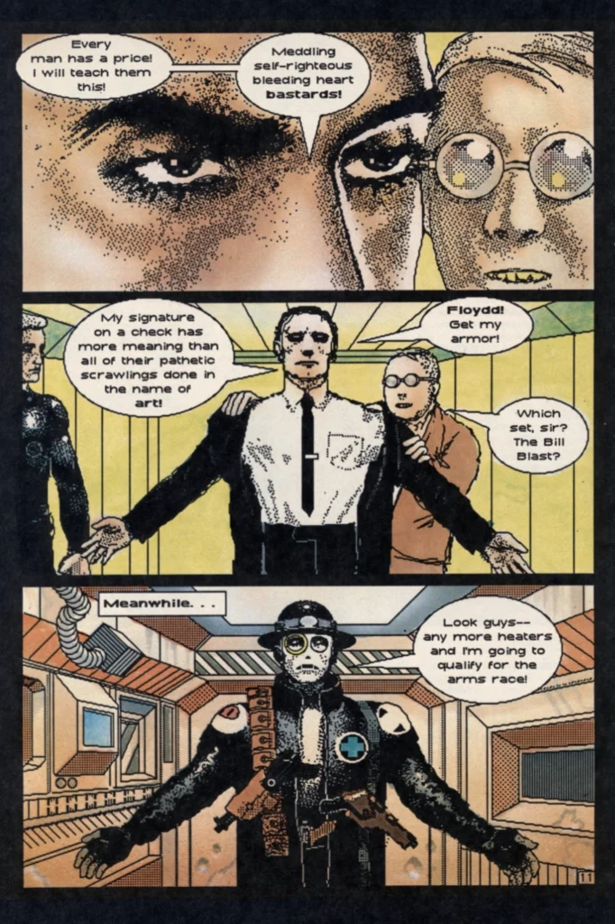
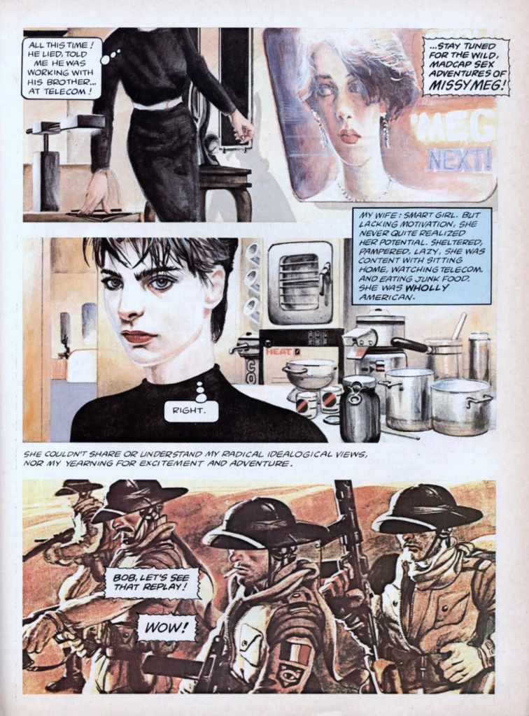
Page from Shatter #1, words and artwork by Mike Saenz. © 1985 First Comics Inc.
Alas, it wouldn’t last. Saenz, along with original series editor Mike Gold, left the book after two issues. The third issue, appearing four months after the second with a cover date of June 1986, featured a cover by Saenz but an entirely new creative and editorial team. New writer Steven Grant tried to finish the story in the vein begun by Saenz, but falls even further into cliché with a plot that seems to have been lifted wholesale from William Gibson’s 1981 short story Johnny Mnemonic. Worse, as freely explained in an editorial piece in Shatter #4, the artwork was now being drawn by hand and then scanned in to have computer “effects” added, which seems like a bit of a cheat. What started out as an experiment to see if the Macintosh could be used to produce comic book art is now just an attempt to make a traditionally produced comic book look like it was done on a computer.
Original writer Peter B. Gillis returned to the series with issue #5, but his short run as writer only served to further undermine the original premise by moving the story to the jungles of southeast Asia – the plants and animals that feature heavily in the backgrounds tend to emphasize the shortcomings of the “computer” artwork. Perhaps in response to overwhelmingly negative reader feedback, the story quickly moved back to its traditional near-future urban environment, and gained a new artist in Charlie Athanas, who appeared to return to generating the line art entirely on the computer. Athanas stayed with the series right up until the 14th and final issue, and served as co-writer on the last two issues.
Shatter #3 cover artwork by Mike Saenz. © 1986 First Comics Inc. 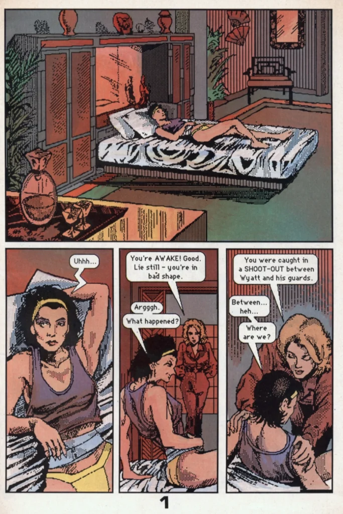
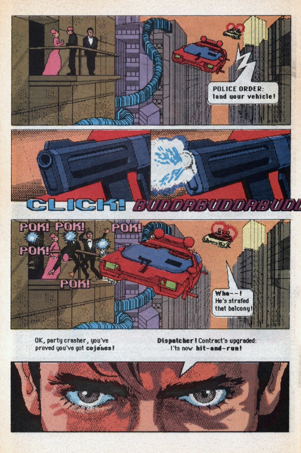
Page from Shatter #3. Words by Steven Grant, artwork by Steve Erwin and Bob Dienethal. © 1986 First Comics Inc. 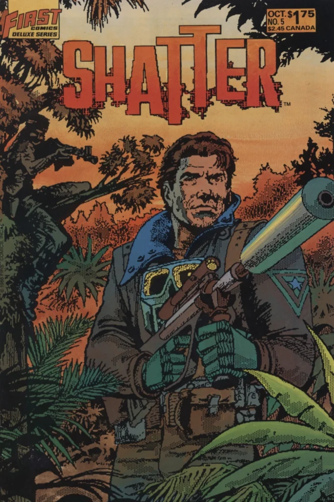
Shatter #5 cover artwork by Steve Erwin and Bob Dienethal. © 1986 First Comics Inc. 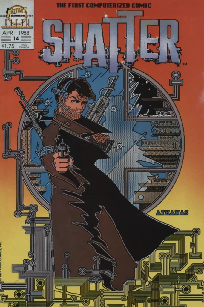
Shatter #14 cover artwork by Charlie Athanas. © 1987 First Comics Inc.
With issue #14, First Comics editorial director Rick Oliver declared that “for now, Shatter has served its purpose, and it’s time to move on.” Throughout the run, Oliver (and previous editor Mike Gold) had talked up the advantages of using the Macintosh as a drawing tool, specifically the ability to create the artwork in layers, to easily repeat images and backgrounds, and to store the finished artwork digitally where it would ostensibly be safer than physical art boards gathering mold in a damp warehouse. In this, they were certainly ahead of their time, and eventually everything they predicted would more or less come to pass. It just took the digital tools a while longer to get to the point where they could be used to create artwork that was indistinguishable from the hand drawn.
But, when it was on top of its game, the real brilliance of Shatter was that it used the shortcomings of its tools to craft a comic book that was truly unique.
Computerized Comics 2.0
Iron Man: Crash and Batman: Digital Justice
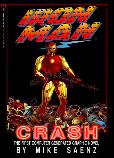
Original Shatter writer/artist Mike Saenz followed up with Iron Man: Crash, a Marvel graphic novel published in 1988. While it adds computerized color and supposedly more sophisticated imaging tools, it fails to live up to it’s predecessor’s promise. Shatter’s dense backgrounds are replaced by scanned photographs and, more often, no backgrounds at all. The 3D models are often blurry, the computer color bland and uninspiring, the lettering small and without character, and the technobabble laden story is virtually incomprehensible.
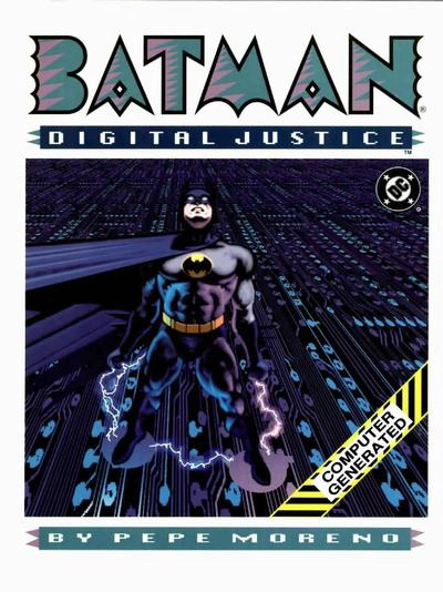
DC tried to get in on the game in 1990 with Batman: Digital Justice by Pepe Moreno (like Saenz, an accomplished conventional illustrator and Epic Illustrated alumni), but by then the novelty of computer-created artwork that looked like computer created artwork had definitely worn off.